It may seem only five minutes ago that Jordan Henderson lifted the Premier League trophy in an empty Anfield, but it’s only a fortnight before the new season kicks off on 12 September and kit manufactures have wasted no time designing egregiously priced holes in punters’ pockets. Still, new kits are one of the best flavours of anticipation to a season and, despite all the changes to football in current times, this is one thing that remains the same.
Here, we take a look at all the new strips released: home and away; goalkeeper and third; dull and interesting; ugly and beautiful.
Arsenal

Arsenal’s new kit, worn above by the triumphant Pierre-Emerick Aubameyang – just before he dropped the FA Cup – is a classy, round-collared affair. It is a darker, deeper red than previous iterations, almost burgundy, with a zig-zag pattern. The goalkeeper kit is an extremely goth metal black. The away kit is yet to be confirmed but going by the poor staffer who uploaded it to Asos pre-embargo (as well as a blue third kit), it looks as though it will be a white and red marble effect. The marble is meant to be a hat tip to the hallowed halls of Highbury, but has been compared to raspberry ripple ice cream and blood splatter, which is unfortunate. We are, meanwhile, still urged to Visit Rwanda.
Aston Villa
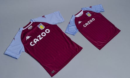
Aston Villa’s new home strip isn’t much to write, er, home about. The barely-there pinstripes are nice but a design element associated with barristers doesn’t scream excitement. Still, what I always enjoy about the Kappa logo is it looks like a couple who have fallen out. The badge is silicone and the sleeves are, in the tradition, blue. You don’t mess with that. The emblematic lion is near the collar on the “reverse”, which is manufacturer speak for the back. The goalie strip is a dark green with yellow accents. W88 is out and new sponsor Cazoo is in; a brand name I hate saying because it sounds like a children’s television character. The away kit (and third) isn’t yet announced, so I’m assuming all games will be played at Villa Park this season.
Brighton & Hove Albion

The Seagulls’ kit, modelled above by new boy Adam Lallana, is lovely and is inspired by their 1983 shirt; although that did happen to be the year the team were relegated (but also reached the FA Cup final). The lack of fat white stripes may not be universally embraced, and though I love the collar, not everybody agrees judging by the fan who commented on Twitter: “The collar is an abomination.” The sponsor remains American Express, a card I’m still to see accepted anywhere in the UK.
If you’d like to watch an overly earnest but actually quite emotional promo video, narrated by Bobby Zamora, you can do that here.
Burnley
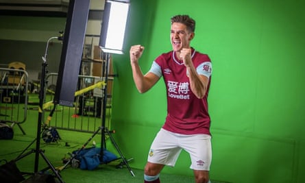
Burnley took so long to announce their new kits that they had already been leaked via Panini cards. As with many clubs’ forthcoming kits, the Clarets’ one pays homage to successful seasons past. In this case, the inspiration is a literal antique kit – the 1920-21 outfit in which the team went 30 games unbeaten. The collar has a V-shaped cut in it, which, if we’re being mean, looks like an unintentional tear, but we’re not, so I’ll say that it’s actually a design that stands out over pedestrian collar choices. The goalkeeper kit is a bright orange.
If you want to watch a promo video that is so long it feels like a Peter Jackson film, then you can do that here.
Chelsea
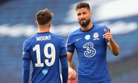
Chelsea showcased their new home kit towards the end of last season, and as far as press releases go, theirs might be the snobbiest. The herringbone detail on the new jersey brings “a touch of Savile Row to Stamford Bridge”. Tammy Abraham says: “You can see the story behind the kit with how it looks and all the little touches that remind you of a good suit.”
The away kit, which is similar but in light blue, is “inspired by a classic tailored aesthetic but filtered through a modern street lens and colour palette”. I do not know what a “modern street lens” is, so we’ll move on. The home goalkeepers’ kit is a nice, bright green, with a sort of fingerprint background. There is a rumour about the unreleased and unconfirmed third kit, which looks quite a bit like a Crystal Palace kit. Speaking of which …
Crystal Palace
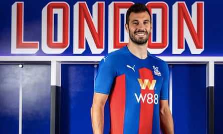
The Palace home and away kits are a good-looking duo (see also: Jordan Ayew and Jeffery Schlupp modelling them here), as is the third. Puma’s designs are the same across all kits, as in 2012-2013, with different main colours (home: blue; away: white; third: black).
I especially like how chairman Steve Parish admitted to essentially nicking the idea from a fan: “I was immediately inspired when I saw the concept from a supporter who had shared designs on Instagram, with perfect synergy across all the kits for the upcoming season. Working closely with Puma and our design team at Crystal Palace, we believed these were the designs we had to bring to life, and I’m proud to say we’ve done so.”
Everton
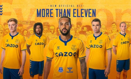
I’ll focus on Everton’s away kit, because it’s a throwback to the amber of the late 60s and early 70s away kits. As with the home kit, the shoulders feature the sporty chevrons beloved of designer, Hummel. Whether the printed badge will stick properly to the shirt – a problem reported previously by fans – remains to be seen. The goalkeepers’ away kit is a very snazzy pink number with what looks like a heart monitor on it. It’s a great kit, though somehow not in keeping with the plain yellow of outfield.
If you’d like to watch an overly earnest but actually quite emotional promo video – again – you can do that here.
Fulham

Fulham have yet to announce their kits, but to be fair they did have a lot going on. ie winning promotion back to the Premier League. Still, it does rather feel like the Titanic meme of older Rose saying: “It’s been 84 years”… and still no kit. Fans can only hope the new kits will be as suave as Scott Parker.
Leeds United
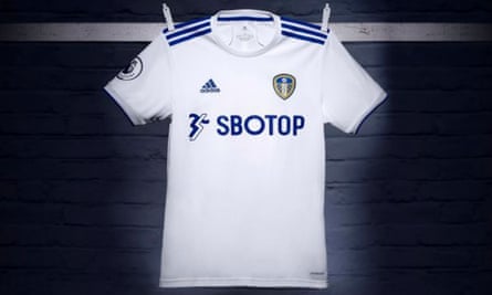
Fans have been in raptures over the new Leeds home shirt, and it is easy to see why; it is simple design with understated blue accents. Even though I have no idea what “white waffle” is, which according to the official website is what it is made of. It is unfortunate too that new sponsor, SBOTOP, resembles a bad hand in Scrabble. The kit has been so popular that errors on the online shop mean that some people have ended up being charged £500 for shirts they haven’t actually managed to purchase. It’s a good kit, but perhaps not that good.
Leicester City

Golden Boot winner Jamie Vardy here, wearing Leicester’s kit, which features a new sponsor, or a slogan, at least: Thailand Smiles With You. This has been chosen by the tourism authority of Thailand, which makes sense, because as a slogan it is pure tourist board. Rather confusingly, fan replica shirts will still feature King Power as the sponsor, as will the first-team shirt in cups. So I guess Thailand Smiles With You, Sometimes. The home goalkeepers’ kit is all black with green accents.
If you want to watch a cringeworthy promotional video narrated by Vardy, you can do that here.
Liverpool
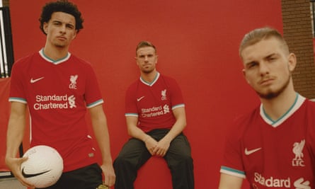
I am biased, but I love it. At first I was not sure about the teal accents – a bit Wrigley’s Cool Breeze chewing gum – but it is an appropriate homage to the Liver Bird statues, and it works. I can still almost smell the mint, but that’s no bad thing – it reminds me of Jürgen Klopp’s insane teeth. It’s a beautiful first kit for Liverpool and Nike, even though I did rather like the underdog feel of New Balance.
The away kit is full on teal, and full on in general. With pattern elements that look a bit like torn paper but also the sea. It’s bonkers, and about four designs in one, but at least it isn’t dull. The third kid is ostensibly a black, squared number, but to be confirmed. As for Alisson, he’ll be wearing black at home and yellow away.
Manchester City

As a Liverpool fan, it pains me to say it, but City’s new kit is great. Puma was inspired by the artwork of Mark Kennedy, responsible for the mosaics around the city – hence that jagged pattern. The away kit is shiny black and embossed with the sort of posh wallpaper pattern that might come from Osborne & Little. The ostensible third kit I rather like, although somehow has, fairly accurately, been described as “economy toilet paper”. Ederson will be wearing black at home, green away and a banging pink for third. I have no idea what Kevin De Bruyne is doing in this photograph, by the way. Possibly playing American football but without a ball.
Manchester United

The new United home kit – worn for the first time (above) during the Europa League tie against Lask – has the pattern of a bus seat, but according to a video on the club website it is made of “DNA” (as beloved by Ole Gunnar Soljskær). It isn’t, it’s made of polyester. And yet, somehow, despite being an Arriva doppelganger, it is rather nice. A lot of the details are frankly too intricate to notice (apparently it has Manchester United written into the fabric) but the stitching element is pleasant. But it’s not a huge departure when you’d need glasses like 90s Deirdre Barlow to notice it.
Meanwhile, canny fans have noted that the ostensible away kit (not confirmed) seems to be inspired by Joy Division’s Unknown Pleasures.
Newcastle United
𝘼 𝙣𝙚𝙬 𝙡𝙤𝙤𝙠.
🥁 Introducing our 2020/21 @pumafootball away and third kits.
⚫️ #NUFC ⚪️
— Newcastle United FC (@NUFC) August 10, 2020
Some good news for the Magpies amid their shambles of a takeover bid: their new kits are good. The underwhelming and same old but new home kit (and goalkeepers’ strip) was released a little while ago – it’s a burden of the club colours that the team will always look like 11 referees – but the away and third kits have now dropped and they are quite something. The official blurb on the away kit uses the words “fizzy yellow” approximately 400 times, though it is more of a lime green. Basically, these kits are on acid, which you can see in the picture above. So is the goalkeeper away kit, which is even better in hot pink and has a honeycomb base, similar to City’s goalie kits.
Sheffield United
Adidas’s new kit for the Blades has an angular black collar with traditional red and white stripes and, on the back, a quirky touch with the stripes only on the lower half of the shirt (though it’s possible a full back worth of stripes wouldn’t be allowed by the powers that be). The away kit, described as “glory pink and solid grey” is one of the nicest for the season. The shade of pink is similar to that of Manchester United’s away kit in 2018-19, which was endearingly based on the page colour of a historical local footy paper.
Southampton

In terms of a throwback this has to be the biggest of all; Southampton celebrate their 135th anniversary with this homage to their very first kit in 1885. It is being billed as “the sash is back”, and that it is. (Although back in 1885 it was a physical sash worn atop the shirts.) The home kit is red with a white sash (black shorts), and the third kit is white with a red sash (plus white shorts).
The away kit is a sashless outlier, in blue with yellow accents. It’s fine but could easily be a supermarket uniform and I doubt fans will be pleased that it’s basically a Portsmouth kit. It would have made more sense for the third kit to be the away kit imho, but then no one at Under Armour asked me. The goalkeeper kits come in neon pink and yellow, like radioactive Battenberg. But, as we’ve seen, that’s a look I endorse.
In scenes of recent drama, Southampton have dropped the LD sponsor, as seen above, for reasons that aren’t clear, but the club statement refers to an “extremely complex situation”, which I guess is the football kit equivalent of a Facebook relationship status of “it’s complicated”. The Chinese brand was not deemed an “appropriate partner” and a hasty one-year deal struck instead with a betting firm. I’ve never thought betting firms were appropriate partners either, but again, I was not consulted.
Tottenham Hotspur
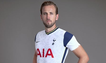
This is a handsome, refreshing design from Nike. The v-shaped collar with yellow is much more interesting than recent efforts – Spurs kits are often a little lacklustre. The navy half-shoulders are nice too. It has the vibe of when someone makes the effort and scrubs up surprisingly well.
Harry Kane, presumably reading from a sheet of paper in front of him, says of the dark green away kit that the “small details make a big difference”. The thing is, they actually do: the “lava” (read: salmon pink) and black touches avoid a by-numbers feel as does the dark green itself – a rare hue in kit world. This time the collar is round.
If you would like to watch a promo video with – for some reason – creepy, haunting music, then you can do that here.
West Bromwich Albion
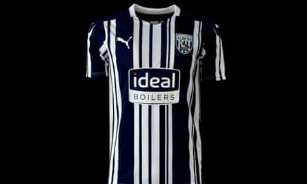
The Puma shirt for the promoted Baggies harks back to the popular “barcode” design of 1992-93 (also a promotion season). Unclear whether it has to be put through a self-checkout a minimum of three times to be recognised. The away shirt has the same retro design but in the yellow and green colours that have a long history for the club, and have been popular with fans since their resurgence over the past couple of seasons. The shorts have switched back to green from yellow. For some reason “Ideal Boilers” as a sponsor will always make me laugh.
West Ham United
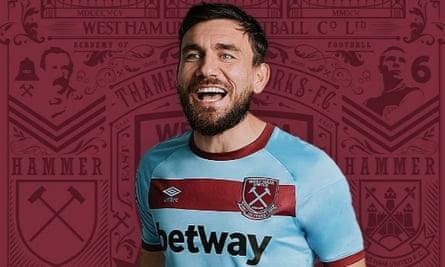
The new Hammers home kit is pretty rote, but the away version is lovely (seen above), Umbro’s hooped design is reminiscent of the club’s 60s heyday. It is also the 125th anniversary kit, which as far as I can tell, means it has a “125” on the neckline. The away goalkeeper kit, meanwhile, is a fun but Wotsit level orange. And why not?
Wolverhampton Wanderers
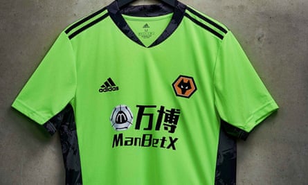
I struggle with Wolves’ home kits purely because black and gold were the colours of my school PE kit. And while I really loved PE, it does mean that, sartorially, Wolves will always be a flashback to netball-after-lunch for me. The new home kit isn’t mind-blowing but the new goalkeepers’ outfit, above, is eye-catching. It’s not a million miles away from last seasons’s – OK, it’s about one mile away – but this is the first season the replica goalkeeper shirt will be available in short sleeves, as preferred by Rui Patrício. It has bolder black accents down the side of the shirt, as well as around the collar. There, you’re all kitted out.
from Football | The Guardian https://ift.tt/34FWcwZ
via IFTTT

No Comment